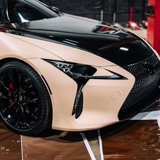
A Lexus LC500 Wrap for Coffee Lovers ☕️
- No Limit Inc.
- Feb 21, 2022
- 5 min read
Updated: May 3, 2024
No Limit Spectrum
Written by Geyson Alvarenga & Kevin O'Brien
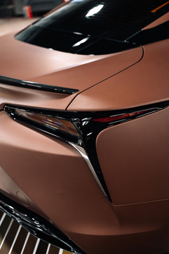
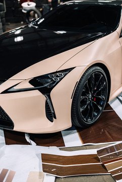
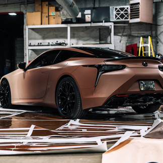
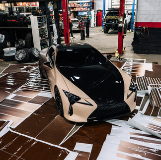
Uniqueness is made of two colors – a delicious mocha brown and a soft-bright Bisque.

Late in 2021 we got asked to do something that (according to Smokey - our vinyl specialist) had only been done one or two times in the DMV. While many may be inclined to say and believe that 'applying a simple dark-to-light gradient would be easy' and hold no complications – well let me stop you there... because otherwise this article would have never come to fruition.
Plan of Attack
Two colors down, hundredths to go.

When it comes to doing something 'fresh' and 'rare' you are like an astronaut in space traveling through an unknown dark universe, where you will never know what you'll discover... mostly because you are doing most of the discoveries by yourself, or have a vague understanding of what many others may have attempted.
And no, by any means we are not saying we are the first at the moon landing here. Though, we did get to the moon, just in a very different approach... one that taught us a lot.
Our approach (and the one we stuck with) was to do a solid 200 inches by 56 inches of vinyl print that covered/matched the vehicle dimensions. This way we were able to keep the gradient travel as accurate as the digital representation, because otherwise printing individual pieces may have created even more unnecessary steps.
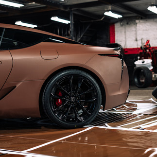
For this iteration, we stuck with the factory wheels, which when powder-coated to gloss black and complemented with wheel spacers it really brought a different element to the already elegant design.
Many of the existing parts of the original vehicle design were wrapped in a non-intrusive gloss black. Headlight accents, tail lights, front grille/bumper, smoked logos and so much more.
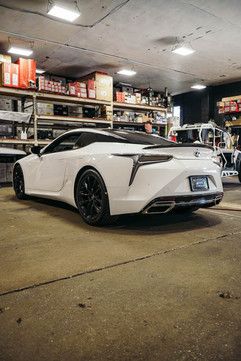
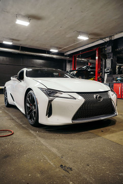
BEFORE
AFTER
Here Comes Technicality...
Bit-Depth, Printers and Headaches.
Before we dive in into the more juicy part of this article we must address the obvious. What's the wrap process like?
To keep it short and simple (as many of you have learned via our Instagram videos) we actually take everything apart. Areas that are susceptible to Heat Shrink are the main focus here, during large amounts of heat the edges of the wrap may contract and reveal the original paint underneath.
Yes, while the process is clearly more work and more time-consuming, we have always prioritized the values of "Quality over Quantity".
Flexi-Sign vs. Adobe Photoshop
Okay, now that we have addressed the most delicate part of the process, now it's time to dive in into the more confusing part of this. Which yes, it has to do with color.
Along the way multiple roadblocks came about, but the one that remained the same was when we printed the gradient onto the vinyl odd colored lines started to appear. Initially, we believed it was a program error not being able to read the correct color management, which basically means it wasn't able to interpret the shades of brown in between that were needed to flawlessly complete the wrap.
To make sense of the situation we ditched Flexi-Sign (which is the program used to manage prints) and launched the trusty Adobe Photoshop since we believed it was all about Bit-Depth.
Well, what is Bit-Depth?
Bit-Depth is the proper name for describing the amount of multiple versions or shades of one color. The more, the better. Below you can see the "rough" to "smooth" gradations between the shades of white and black, the original vinyl printed was done in 8-bits using the Roland SP-540V 4-ink (eco-solvent) printer. The final was done in 16-bits alongside multiple adjustments.
While part of the issue was Flexi-Sign being limited to only outputting 8-bits of color data, we decided to avoid any chances of us having to overlook this simple fix, we tested a 32-bit version but it proved to be a little overkill. We settled on a happy medium making 16-bits the perfect target. Little did we know this was only part 1 of 5 in the process that mostly relied on hardware, but of course, we didn't know that yet.
TEST 2
The second printer we used was the 8-ink Roland VG-540 (eco-solvent). This printer vastly improved the color accuracy, due to it's higher ink count of 4 more prior to the previous model, but it was not enough to pass our approval, neither the customer's. When printing brown, the lines appeared every 12 inches. This phenomenon is known as "Ink Drop-Out" where the coating of ink at certain point isn't as strong as it should be causing such lines.

TEST 3
The third printer was another Roland, this time dubbed the SolJet Pro 4XR-640 (eco-solvent). With no major improvements we decided to one more time, switch printers, modify the original file and move on to the next test.

TEST 4
The fourth printer we used was the Roland TruVIS VGS-540 (eco-solvent) which featured an 8-ink cartridge system with orange. Orange is a color not many printers have as an option, and is one shade closer to brown. This allowed us to reduce the space and amount of ink drop-out by 36 inches, 24 inches of extra space compared to the previous printers mentioned above. Still this did not solve our gradient quality. So... what then? One more test.


TEST 5
The final printer in our now printer-showdown episode is the Canon Colorado 1630 UV-Gel and this was the winner. Before we move on, let's also clarify that all files tested with the printers above were again in 16-bits and had been uploaded straight through each device's ripper program, this way we eliminated the redundant Flexi-Sign as we learned that is limited to only 8-bits of color data.
Not everything was as easy as we may had expected, the Canon Colorado was very close to the color accuracy of the file but was no exact match, so we launched Adobe Photoshop and tweaked the gradient file to now reprint the WHOLE car using this printer and get the job done.
Last but not least, we learned that Roland printers have problems printing solid colors. Brown in our occasion (and if you paid attention in art class) it's made up of a bunch of colors including Blue, Red, Orange and some Black and can be achieved in multiple other combinations but to get the shade you need... well, that's where it gets tricky.

